How will global temperatures change? (Original page from Dec 2010)
Atmospheric scientists use the emission scenarios to predict how much greenhouse gas concentrations will increase in the atmosphere. They can then run Global Climate Models to predict how the temperatures will change in the future, alongside changes in other aspects of the weather like rainfall ![It is more formally called precipitation, which includes rain and snow. [i]](../images/_info.jpg) Even the medium emission scenarios predict increases in average global temperatures by 3ºC, by the end of the centaury.
Even the medium emission scenarios predict increases in average global temperatures by 3ºC, by the end of the centaury.
Changes to global average temperature
The following graphics are taken from IPCC 4th Assessment Report (AR4 ![Note this 4th Assessment Report (AR4) was published in 2007. Other abbreviations in the figures: TAR = Third Assessment Report; WG1 = Working Group 1; the B1, B2, A1T, etc are all emission scenarios. [i]](../images/_info.jpg) ): Working Group II Report "Impacts, Adaptation and Vulnerability" (Technical Summary).
): Working Group II Report "Impacts, Adaptation and Vulnerability" (Technical Summary).
- The following figure shows the global temperature changes expected as a consequence of following the various SRES scenarios discussed. Note that the coloured dots are average predicted temperature rises for different years, e.g. the B1 scenario predicts an increase of about 1.3ºC by the year 2050. The red lines are the statistical uncertainty bands around the predictions for the 2090s.

- The next figure is similar but shows temperature rises for different concentrations of Greenhouse Gases (particularly carbon dioxide [CO2]), which relate to data discussed in the Emission Targets pages.
.jpg)
Climate change predictions for a number of emission scenarios are also available in a table in the IPCC AR4 Synthesis Report. For example, by the 2090s the B1 scenario predicts that temperatures will rise by 1.8ºC (likely range between 1.1ºC and 2.9ºC). The A1FI scenario predicts that temperatures will rise by 4.0ºC (likely range between 2.4ºC and 6.4ºC). These changes are all relative to the 1980s, which in tern were 0.5ºC warmer than the period from 1850-1899.
What does the 2ºC limit look like?
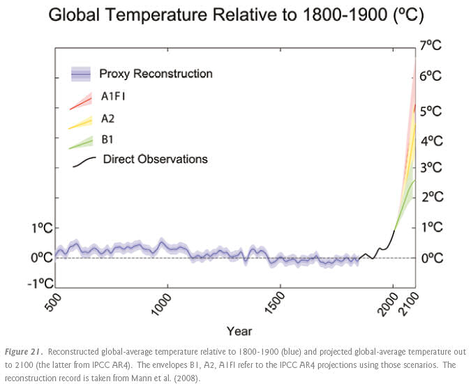
That we "must limit global temperature rise to no more than 2ºC above pre-industrial levels" is a phrase you will hear a lot in climate change literature. The following graph is from the Copenhagen Diagnosis. Notice that each of the SRES scenarios reach temperatures that are much higher than anything we have experienced in the past 1,500 years. And notice as well that the 2ºC limit is lower than the predictions from the most benign B1 emission scenario. ![Notice that by the 2090s, B1 is predicted to be 2.3 degC higher than 1850-1899 average [i]](../images/_info.jpg) It does not look very likely that we are going to meet that limit.
It does not look very likely that we are going to meet that limit.

It is worth considering, when you are looking at the graph, that the rise in temperature does not stop at the year 2100. Only the B1 emission scenario shows any sign of starting to stabilise towards the end of the centaury. Our grandchildren (assuming you are my age) will find themselves in a much hotter world.
How does it vary across the world?
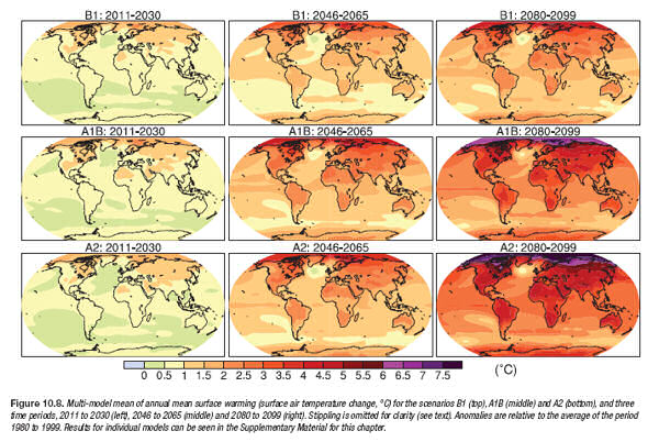
The following graphic is taken from AR4 Working Group I Report "The Physical Science Basis", Chapter 10. This demonstrates how mean annual air surface temperature is predicted to changes across the planet. Three emission scenarios are shown: B1, A1B and A2; and you can see the change increase through time, from 2011-2030 period to 2080-2099. Notice that the Artic is predicted to get a lot warmer than it is at the moment. Other parts of the world will be less effected. Notice as well the significantly higher temperatures predicted in the bigger emission scenarios.

.jpg)
Return to main Consequences page

![link to W3C validation website, which will show that the stylesheets are Valid CSS [css]](http://jigsaw.w3.org/css-validator/images/vcss-blue)
![link to information about this website [info]](../images/btn_info.jpg)
![jump up to the top of this page [top]](../images/btn_top.jpg)