
A quick note on uncertainty
There is uncertainty in climate modelling. The results that you will find from the IPCC and other organisations will try to describe this by giving the statistical uncertainty bands around their results. Hopefully this page will help to describe this relatively complicated subject.
You will see uncertainty bands (or ranges) in many of the results, graphs and data tables that come out of climate change research. For example:
- The medium emission scenario gives an estimated increase of 3.5ºC (between 2.2ºC to 5.2ºC)
![[i]](../images/_info.jpg "Note that these figures are approximate and taken from the UK climate projections 2009 (UKCP09). In fact the UKCP09 has 'probabilistic' projections, which are based on 'weight of evidence' rather then vigorous statistical methods.") in mean annual temperature, for the South East of England, for the end of the century.
in mean annual temperature, for the South East of England, for the end of the century.
The figure 3.5ºC is the average warming for that emission scenario. This will be based on hundreds (or thousands) of climate model runs, all of which will have come up with different results. 3.5ºC is the average of all of these results.
If you plotted up all of the results of these model runs you would get a graph a bit like the following. With the number of model runs (left axis) predicting each level of temperature change (bottom axis). This is a probability distribution, and from this you can read the range given in brackets (2.2ºC to 5.2ºC) as the 10% and 90% probability figures. You can consider this to be an uncertainty band.
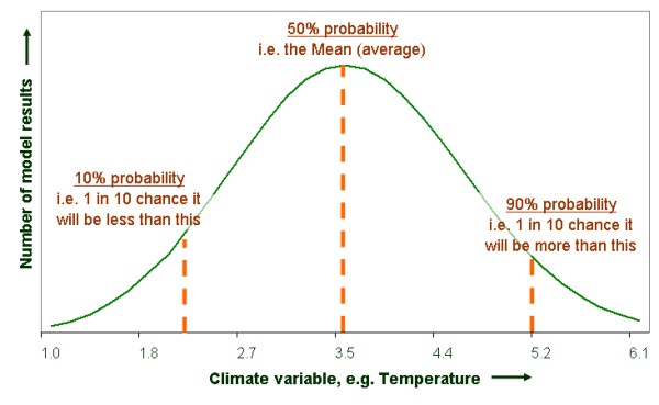
Notice that each model run is just as likely to be correct as any other. In this case the average temperature result happens most often, as shown by the peak. In reality the curve could be a different shape, for example skewed more towards higher temperature results than lower ones. The uncertainty band gives you an indication of this. The width of this band will also give you some idea of the level of confidence you can have in the average.
- Another example is in the following quote from the IPCC "...the best estimate for the low scenario (B1) is 1.8ºC (likely range is 1.1ºC to 2.9ºC)...".
![[css]](http://jigsaw.w3.org/css-validator/images/vcss-blue "link to W3C validation website, which will show that the stylesheets are Valid CSS")
![[info]](../images/btn_info.jpg "link to information about this website")
![[top]](../images/btn_top.jpg "jump up to the top of this page")