Daily Minimum Temperature Changes in March
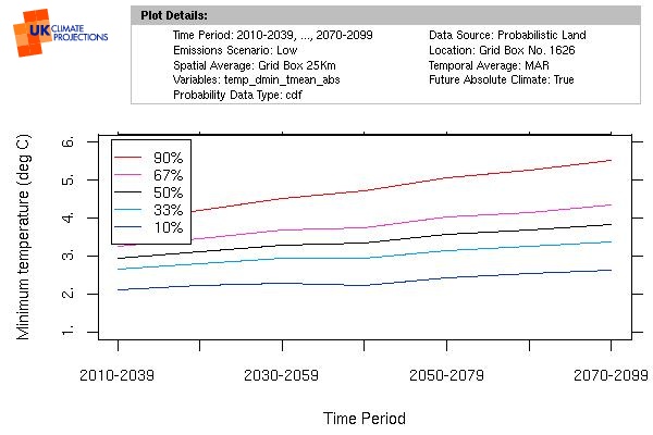
There is a general trend of increase in minimum temperature. Under the high scenario, this tends to increase after the 2050s. Probability bands are very similar up to the 2050s but the higher scenarios get wider and flatter after this. There is less variation than for the maximum temperatures. Spatially, little variation can be seen in minimum temperatures across all of England, for either scenario. March 2080 temperature curves are very slightly wider than for the March-May Spring season, hence the change in temperature of the coldest night is likely to be slightly higher; there is not a lot of difference between the scenarios suggesting central estimates of approx 1.5ºC warmer nights in either case.
Under the Low emission scenario, there is a 67% chance that average daily maximum temperatures for March:
- By the 2050s, will be between 2.5ºC and 4.3ºC. This would be between 0.6ºC and 2.4ºC warmer than they were in the 1970s.
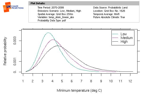
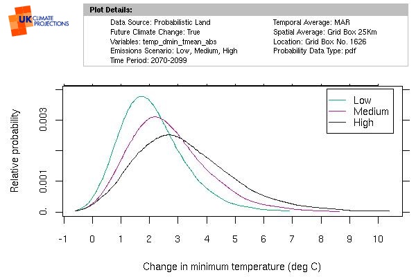
- By the 2080s, will be between 2.9ºC and 5.0ºC. This would be between 1.0ºC and 3.2ºC warmer than they were in the 1970s.
Under the High emission scenario, there is a 67% chance that average daily maximum temperatures for March:
- By the 2050s, will be between 2.9ºC and 5.0ºC. This would be between 1.0ºC and 3.1ºC warmer than they were in the 1970s.
- By the 2080s, will be between 3.5ºC and 6.7ºC. This would be between 1.6ºC and 4.8ºC warmer than they were in the 1970s.
Probability range
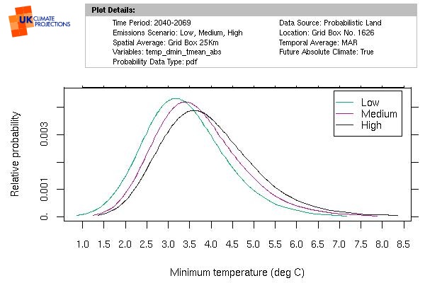
March Daily Minimum temperatures in the 2050s
|
|
March Daily Minimum temperatures in the 2080s
Time and space
|
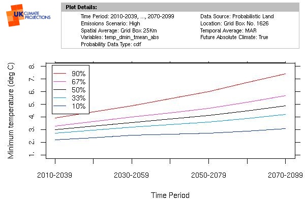
|
| Daily Minimum temperature for March through time under the Low emissions scenario | Daily Minimum temperature for March through time under the High emissions scenario |
|---|---|
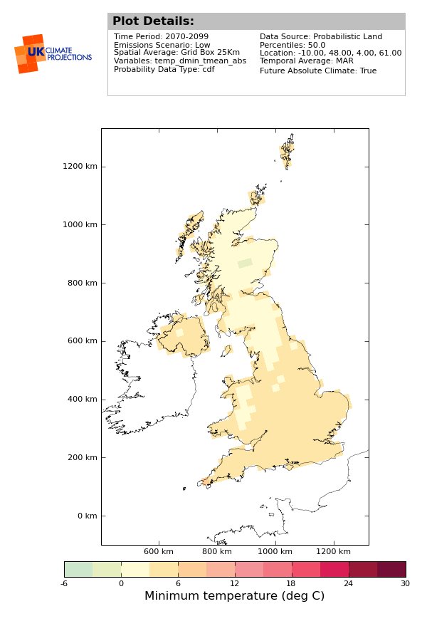
|

|
| Map of daily Minimum temperature for March, in the 2080s, under the Low emissions scenario (at 50% probability) | Map of daily Minimum temperature for March, in the 2080s, under the High emissions scenario (at 50% probability) |
Coldest night
Estimates for the highest and lowest temperatures are only available at a seasonal level. It is therefore sensible to check how the seasonal averages compare to the monthly averages.
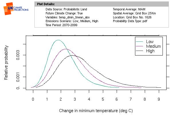
|
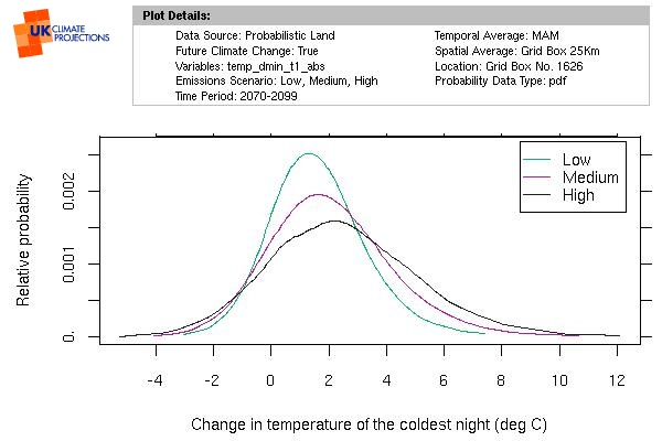
|

Return to Temperatures in Reading page
Please notice that all of the maps and graphs are copyright © UK Climate Projections 2009

![link to W3C validation website, which will show that the stylesheets are Valid CSS [css]](http://jigsaw.w3.org/css-validator/images/vcss-blue)
![link to information about this website [info]](../images/btn_info.jpg)
![jump up to the top of this page [top]](../images/btn_top.jpg)