Central England Temperature with Climate Change Projections
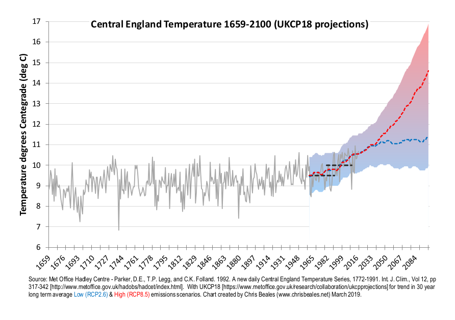
This is a graph that I have shown many many times over the last few years. It illustrates the scale of climate change, and how it will affect us in England.

The grey line is the Central England Temperature (CET) record : this shows that, despite year-to-year variations in annual temperatures, temperatures have rarely been above 10 degrees C in the past 360 years; that is until you look at the last 30 years, which are notably warmer, and show how our climate is starting to change.
The plume of rising temperatures - shaded from blue to red - show the range of model results from the latest UK Climate Projections 2018 (UKCP18). Notice that the blue dashed-line is an average, assuming we limit greenhouse gas emissions to meet the original 2 deg C Paris Climate Agreement target. The red dashed-line is high emissions future, modelled to assume a reasonable worst-case of: high global economic growth, powered by intensive fossil fuel emissions. Either future is considerably warmer than we have experienced in the whole CET record. The high-emissions future would be very concerning indeed.
More info on building the graph
In the description of the CET record, the Hadley center met scientists note that "...These daily and monthly temperatures are representative of a roughly triangular area of the United Kingdom enclosed by Lancashire, London and Bristol...". They also note that "...the monthly series, which begins in 1659, is the longest available instrumental record of temperature in the world...", which makes it really interesting.
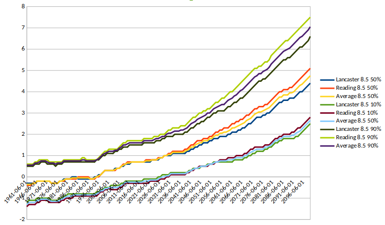
Adding the UKCP18 data to this is a powerful way of illustrating how climate change is going to make such a profound difference for us. I created a similar graph, using the previous 2009 climate projections (UKCP09) for my Extreme Events and Climate Change presenation. The latest climate projections offered the oportunity to create a more detailed graph, with an annual variation in the long-term average trends. I wanted to add a bit more scientific vigour by averaging temperature changes projected for the southern edge of the CET triangle (Reading was the obvious choice); with those from the northern apex (I chose Lancaster). The UKCP18 data is available in a similar form to the 2009 projections so extracting the data required similar thinking to what I worked through in the But what does it mean for me? section. You can see the result of the high emissions temperature plumes in the graph below. The warming in the south of the country is greater than in the north. At the 50 percentile level, it is nearly 1 deg C different by 2100. The simple average I generate for the final plot will be crude but, reasonable for the sake of this illustration...and certainly fair, given the uncertainty inherent in the climate projections anyway.

The low emission scenario data is developed in the same way. Note for this the north/south differences are smaller. Also for information on the scenarios, see the second section in this page. In the final graph, the low and high temperature plumes are blended, as they do overlap. Hence the final temperature plume is showing a certainty band where we are 90% sure that temperatures will be at least as warm as this, even in a low emissions future; and 90% sure that temperatures will not exceed the top of the plume, even in a high emissions future.

![link to W3C validation website, which will show that the stylesheets are Valid CSS [css]](http://jigsaw.w3.org/css-validator/images/vcss-blue)
![link to information about this website [info]](../images/btn_info.jpg)
![jump up to the top of this page [top]](../images/btn_top.jpg)