New UK targets
The UK is part of the 27 European countries that negotiate together to agree international targets for emissions reduction. As a group we pledged to cut emissions by 20% to 30% by 2020 in the Copenhagen Accord. If the more ambitious target is adopted, this will mean that the UK will be signing up to a more ambitious 42% cut in emissions. This section shows that this will make a positive difference to global CO2 emissions. By comparison, weaker targets could see us following the worst case emission scenario until at least the 2020s.
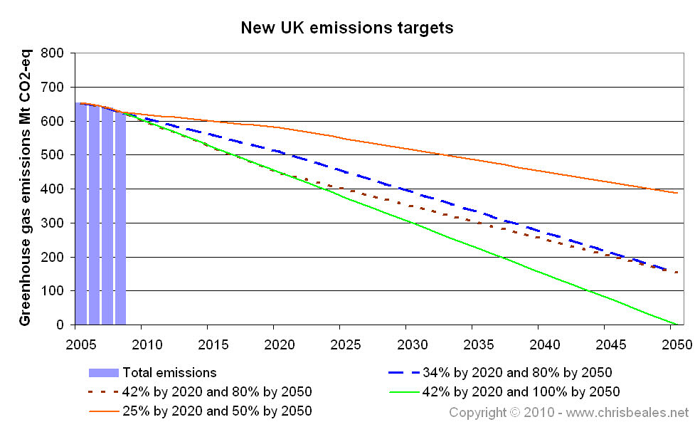
The lines on the following graph show a range of possible future emissions from the UK.
- The blue dashed line shows the current UK target line (as developed in previous pages).
- The brown dotted line shows the a new interim target of a 42% cut in greenhouse gases by 2020. Notice that this was recommended by the Committee on Climate Change in their April 2009 press release.
- The orange line shows a possible future where we weaken - or fail to meet - our targets. Notice that the future could very well be worse than this! Here we have a cut of 50% by 2050.
- The green line show a future with us setting even stronger targets, where we reduce UK emissions to zero by the 2050s.
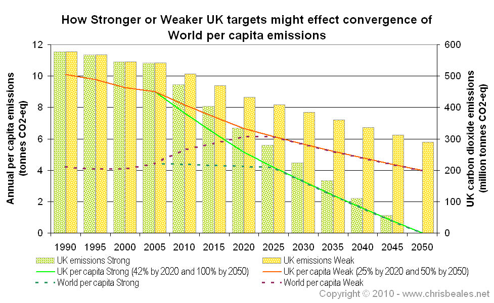
The effects of the strong and the weak targets from above, are shown in the following figure. Notice that we have switched from total greenhouse gas emissions to focus on carbon dioxide emissions from the UK.
- The bar chart shows CO2 emissions and refers to values on the right-axis. You can see the green (strong) bars dropping to zero, and the orange (weak) bars dropping to 50% of baseline by 2050.
- Overlaying this: the green and orange lines refer to the left-axis, and are the equivalent UK per capita emissions.
- The turquoise and purple dotted lines also refer to the left-axis. These are the World per capita emissions lines assuming convergence in 2025.
![Notice that this uses the same assumptions that I developed in the pages on contraction and convergence with China. [i]](../images/_info.jpg)
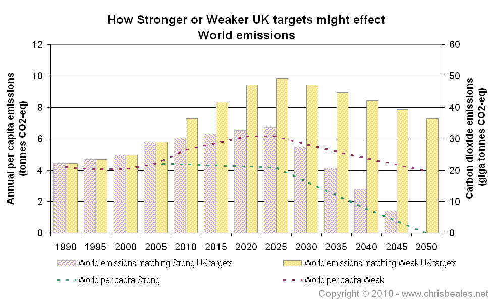
The next figure show how these strong and the weak World per capita emissions lines would translate into global CO2 emissions.
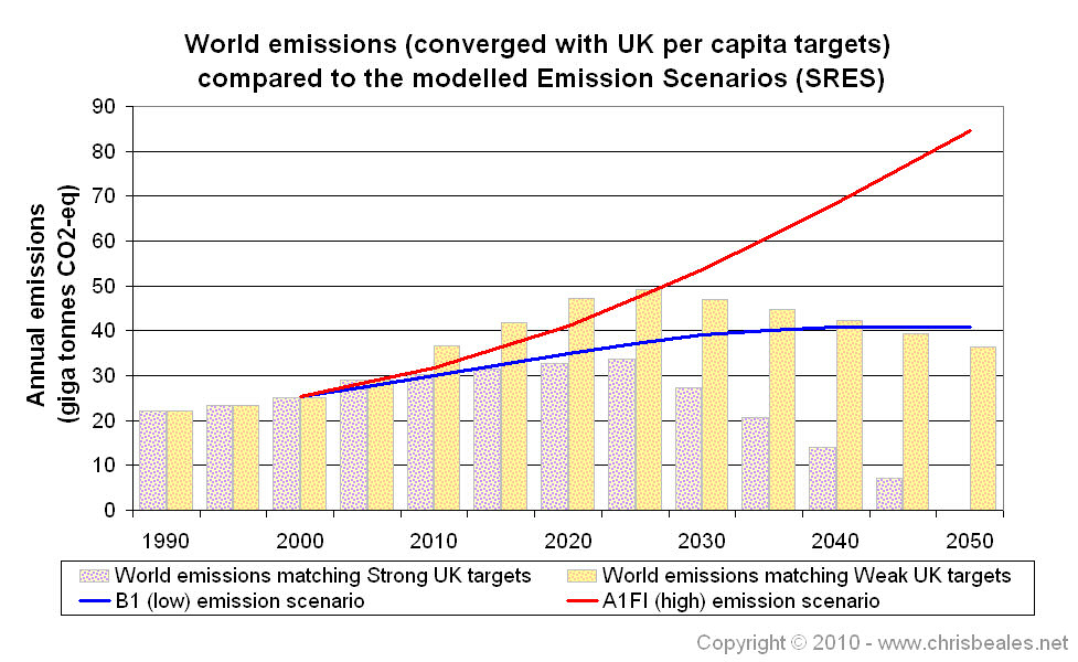
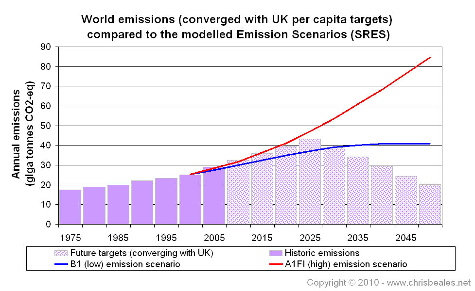
These strong and the weak World per capita emissions are shown against the high and low SRES scenario lines in the next figure. For comparison, the second chart is that developed in the page on UK influence on World emissions, which shows World convergence with the current UK emissions targets (e.g. 34% cut by 2020 and 80% cut by 2050).
- Notice that the strong target brings global CO2 emissions in line with the low scenario up to 2020. This is matching the 42% UK emissions cut, as recommended by the Committee on Climate Change, and it looks like a significant step in the right direction.
- Beyond 2020, the strong target drags global emissions down to zero. This may be impossible, unless a technological solution is found to mop up our emissions.
- The weak target would let global emissions follow the high scenario through to 2025. It does bring us back down after this, crossing the low scenario line in 2040. However, the assumption that the rest of the world would converge per capita emissions with the UK probably breaks down if we show this kind of weak commitment to emissions reduction. If that is the case, global emissions could very well follow higher emission scenario estimates.
.jpg)
Return to main Emissions Targets page

![link to W3C validation website, which will show that the stylesheets are Valid CSS [css]](http://jigsaw.w3.org/css-validator/images/vcss-blue)
![link to information about this website [info]](../images/btn_info.jpg)
![jump up to the top of this page [top]](../images/btn_top.jpg)