What does the Copenhagen Accord mean?
Analysing the pledges that were made by 55 parties that signed up to the Copenhagen Accord, you can see that it does not make for a strong agreement to curb greenhouse gas emissions. With the Accord alone, it seems very unlikely that we will meet the limit of a 2ºC rise in global temperature. The scale of emissions will be very much determined by the growth of countries like China and India, which could have us following the highest scenarios. And it all of course assumes that countries will honour their pledges, which might not be a guarantee.
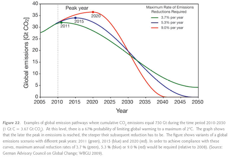
The Copenhagen summit did not agree legally binding emission targets in December 2009. It did however produce an Accord, which most countries "noted". This mentioned the clear aspiration that we should limit global temperature rise to 2ºC. You can see how challenging this will be from the following graph of carbon dioxide emission reductions (from the Copenhagen Diagnosis).

Emissions reduction pledges
By the end of January 2010, 55 countries submitted emissions reductions pledges to the United Nations Framework Convention on Climate Change (UNFCCC). These countries together account for 78% of global emissions and energy use. The pledges are for emission cuts by the year 2020. The following table captures those of the biggest contributors.
- Pledges are from the UNFCCC website on the Copenhagen Accord: Annex I Parties and non-Annex I Parties(including developing countries). Notice that many submissions give a high and a low range, as all countries / parties are wary of committing to economically constrictive targets compared to everyone else.
- The pledges each relate to the Comparison year mentioned, for example the USA state they will cut emissions by 17% compared to 2005 levels (assuming they can get that legislation through Congress).
- Unless mentioned in the notes, all pledges refer to a suite of greenhouse gases including methane and nitrous oxide (see here page for a discussion on how these gases relate to UK emissions - notice that they are likely to be more significant in other countries).
- The emissions data are for coal, oil, gas and cement production and are sourced from CDIAC.
![In my analysis the Annex I countries' emissions have been trended between 1990 and 2005 to match what they reported to the UNFCCC. This may subtly alter the figures compared to CDIAC. [i]](../images/_info.jpg)
- In 2008 the parties in the table emitted 22 Gt CO2
![i.e. 22,000,000,000 tonnes carbon dioxide, from coal, oil, gas and cement production [i]](../images/_info.jpg) , which was 70% of global carbon emissions.
, which was 70% of global carbon emissions.

It is very important to notice that reduction pledges for developing countries do not refer to emissions in the Comparison year. Rather they refer to the economic growth of the country. This makes it quite challenging to work out what future emissions can be expected. Pulling figures out of the World Bank's World Development Indicators database I was able to find Gross Domestic Product (GDP) data for China and India (figures in trillion US$): ![i.e. trillion = 1,000,000,000,000 United States dollars [i]](../images/_info.jpg)
| Country | 2005 | 2008 | Forecast 2020 |
|---|---|---|---|
| China | 2.2 | 4.3 | 14 |
| India | 0.8 | 1.2 | 7.5 |
The final column is a forecast from Deutsche Bank. This forecast was made in 2005, which was before the global recession. I don't know how realistic this is but it is worth considering when looking at the amount of carbon emissions these two countries could be allowed even within the restrictions of their Copenhagen Accord pledges.
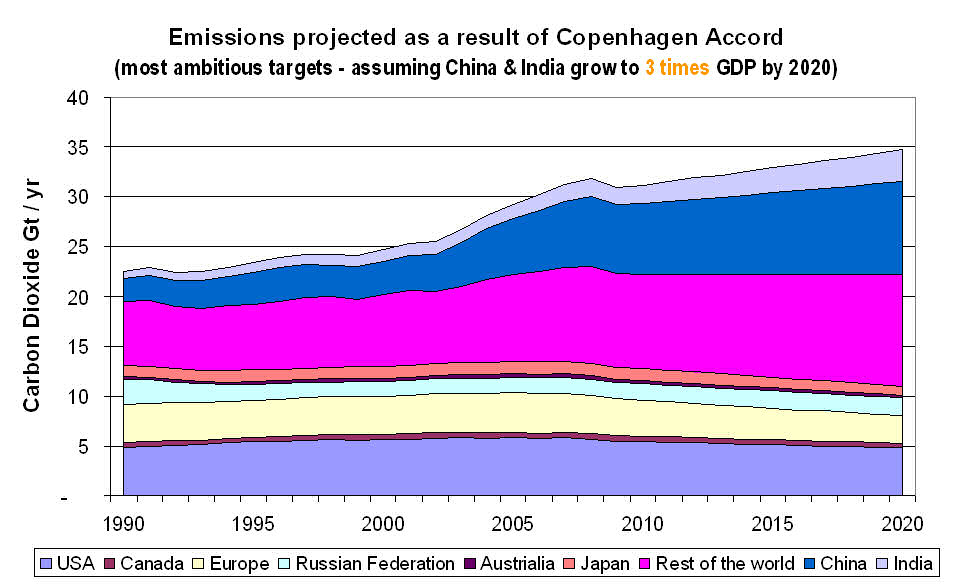
Rather than use the Deutsche Bank forecasts - which had China's economy growing 6.4 times compared to 2005, and India's growing by 9.4 - the following graph assumes that both economies treble in size.
- The other countries are straightforward to project using the figures mentioned above.
- Notice that in all cases I assume that countries will emit as much carbon dioxide as they can, whilst meeting their most ambitious pledges.
- For the rest of the world, I have assumed that emissions will grow linearly as they did between 1990 and 2009.
![In fact I did a very simple linear regression of that period, which grows at 0.18 Gt CO2 per year [i]](../images/_info.jpg)

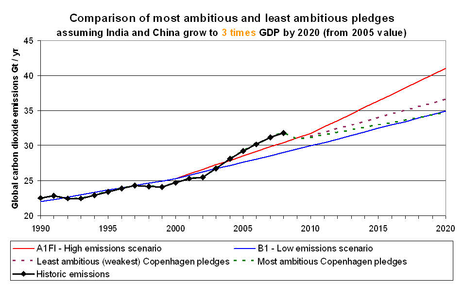
The following graph shows just the global emissions total - again assuming China's & India's economies grow to three times the size in 2005 - but with the range of commitments given by the more ambitious and the weak pledges. These are projected as the dotted lines, which you can see both fall between the highest (A1FI) and lowest (B1) SRES Emission Scenarios. In fact the more ambitious pledges would see us following the low emissions scenario, which looks positive.

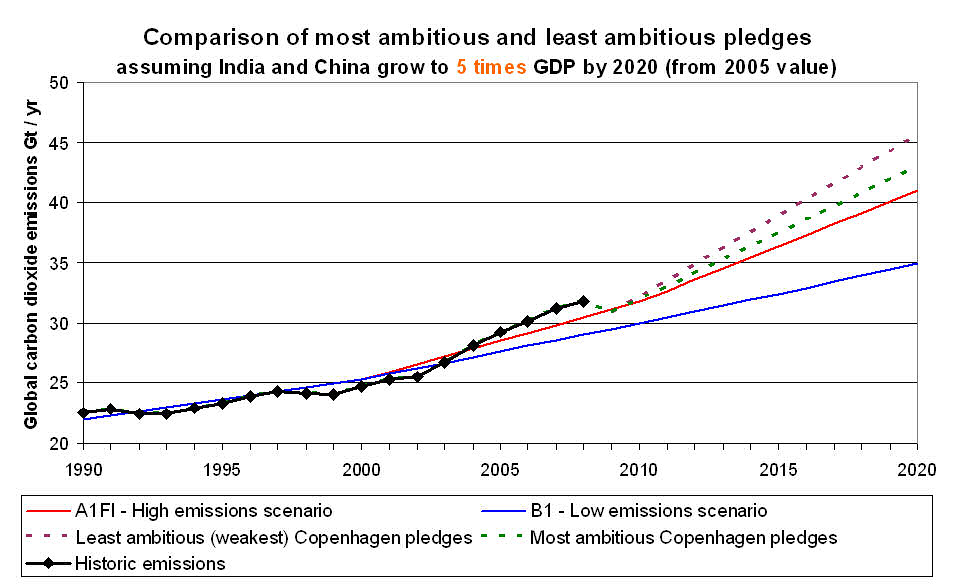
This final graph is the same as above but with China's & India's economies grow to five time the size they were in 2005. You can see that this makes a big difference, pushing the emissions projection above the high (A1FI) scenario line. If their economies approach anything like the Deutsche Bank forecast, the projections suggest that global emissions will be allowed to reach over 50 Gt CO2 per year by 2020.

.jpg)
Return to main Emissions Targets page

![link to W3C validation website, which will show that the stylesheets are Valid CSS [css]](http://jigsaw.w3.org/css-validator/images/vcss-blue)
![link to information about this website [info]](../images/btn_info.jpg)
![jump up to the top of this page [top]](../images/btn_top.jpg)