Temperature changes in March
This is an in-depth look at how the UK climate projections (2009) can be used to understand how climate change will effect temperatures, for me, in the month of March. I introduce you to some real temperature data from the University of Reading Atmospheric Observatory, to help visualise what day-to-day temperatures might be like. And it seems likely that, even by the 2050s, and even under lower emission scenarios, we will see March temperatures that are more like the averages that we are used to seeing for April.

What does temperature data look like? It is important to be able to visualise what real temperature data looks like before we can try to picture what they will be like in a future climate. The University of Reading's Atmospheric Observatory provides a great resource to help with this. A live archive of various automatic weather measurements is available...so you can see what the weather is like in Reading right now!
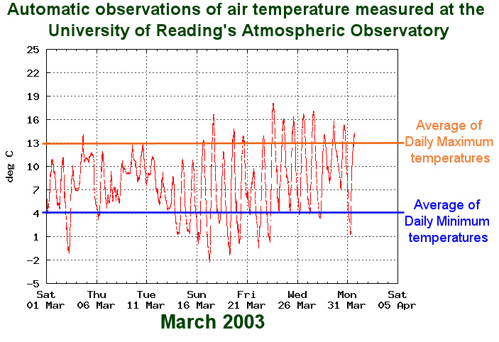
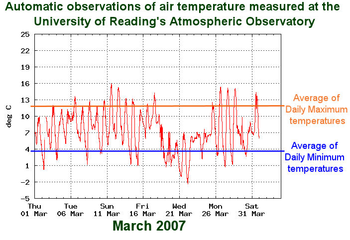
The measurement we are particularly interested in is called the Dry bulb temperature - this is the normal air temperature, which is recorded in a Stevenson Screen, about 1.5 metres above the ground. A couple of examples of temperatures for the month of March can be seen in the following graphs of March 2003 and March 2009.
- You can see the diurnal (i.e. 24 hour) cycle, with minimum temperatures occurring at night and maximum temperatures in the day.
- There are regular patterns, for example between 16th and 21st March 2003 cold nights follow warm days - this may be due to clear skies. At other times, the variation between max and min temperatures is smaller, which may be due to cloud cover.
- There are also breaks in the regular patterns, e.g. 7th March 2003, which may be evidence that a weather front has passed over.
- For all of this detail though, you will notice that I have drawn two lines on each graph: the average daily maximum and average daily minimum temperatures. It is important to note that the information that we have about future temperatures is only at best an estimate of how these averages will change!
- You can see that there was a greater variation in temperature in March 2003 compared with 2007. The average night minimum was slightly higher, and day maximum and hottest day temperatures were both about 1ºC warmer. There were more warm days but there was also more cold nights.
|
|
Please notice that the March 2003 & 2007 data were downloaded between February and November 2010. I am using them for illustrative purposes only. The copyright is retained by the Department of Meteorology at the University of Reading.
Long term averages & Comparison between years
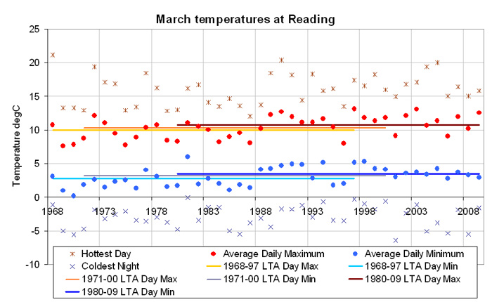
The following graph shows some summary data from March 1968 to March 2009. The red dots are the average daily maximum temperatures, which are equivalent to the orange lines in the 2003 & 2007 charts above. The blue dots match the daily / night-time average minimum temperature. You can also see the hottest and coldest temperatures marked for each month.
- Notice that there is a fair amount of variation between years, for example average daily maximums vary by more than 5ºC between years, whereas hottest days vary by over 10ºC.
- You can see that the example years 2003 & 2007 have relatively similar averages, as well as hottest & coldest days. And that they are both relatively warm compared with other years in the dataset.
- I have drawn long term average period lines on the graph. There are three sets of 30 year periods: the first 30 years, the last 30 years and the 1971-2000 period. Notice that this last case can be considered to represent the 1980s as this is the middle decade. The UK climate projections refer to future periods in a similar way, so if I want to look at data for the 2050s, I am actually looking at estimated long term averages for the 2041-2060 period.
Bands for the 1980-2009 period
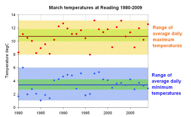
The following graph takes the same data from above but is focused on the 30 year period from March 1980 to March 2009. It shows the:
- March average daily maximum values (red dots);
- average daily minimum (blue dots);
- 1980-09 long term average (LTA) max and min lines (in brown and blue);
- orange and blue bands which encompass the complete range of average day max / min;
- each with a middle, green band, which contains the middle 44% of temperatures.
![This is commonly referred to as the Normal Band - something that my colleagues and I use in the analysis of river flows and other environmental data. The concept of building these ranking bands is from Cunnane (1978). [i]](../images/_info.jpg)
Projections for March
The baseline long term average period used by the UK Climate Projections is the thirty years from 1961-1990 (i.e. the "1970s"). For this period the 25 km square that I am using has a March average daily maximum of 9.8ºC, and average daily minimum of 1.9ºC. It is important to note that these averages are probably slightly different than those of the University weather station.

UKCP09 average daily maximum temperatures in March - There is a general trend of increase in day max temperature. Under the high scenario, this tends to accelerate after the 2040s. Probability bands get wider and flatter through time, more so for the high scenario; and all are skewed such that there are significantly higher temperatures beyond the high end of our chosen 67% band (for example averages could be reach over 18ºC by 2080 under high emissions). Spatially, you can see that temperatures tend to increase towards the south-east corner of the country. March 2080 temperature curves are narrower than for the March-May Spring season, hence the change in temperature of the hottest day is likely to be a little lower, suggesting central estimates of: approx 2ºC warmer under the low scenario and approx 3ºC under the high scenario.

UKCP09 average nightly minimum temperatures in March - There is a general trend of increase in minimum temperature. Under the high scenario, this tends to increase after the 2050s. Probability bands are very similar up to the 2050s but the higher scenarios get wider and flatter after this. There is less variation than for the maximum temperatures. Spatially, little variation can be seen in minimum temperatures across all of England, for either scenario. March 2080 temperature curves are very slightly wider than for the March-May Spring season, hence the change in temperature of the coldest night is likely to be slightly higher; there is not a lot of difference between the scenarios suggesting central estimates of approx 1.5ºC warmer nights in either case.
Visualisation
The following two boxes give you a picture of March in the 2050s and in the 2080s. You can see two blue bars for the Low emission scenario, and red bars for the high scenario. In each case, the one at the top represents where the long term average daily maximum temperature would be, and the one at the bottom represents the long term average daily minimum. Notice that they have been drawn with a thickness to represent the high and low ends of their 67% probability bands. Data is summarised underneath each graph.
- The gray trace of data is of March 2007, which is shown - with the 1980-2009, orange and blue, bands (with their green middle ranges) - to help give visual context to the climate change projections.
- You need to remember that these are from the weather station, which will have a slightly different base line to the UKCP09 square. However, you can hopefully picture how the bands and would have to shift to fit in with the expected climate changes. You can then start to imagine what the gray, day-to-day trace might look like in the future.
- At the University of Reading, the April 1980-2009 average daily maximum was 13.4ºC, and average daily minimum was 4.7ºC. Even the bands of the Low emission scenario in the 2050s encompass these temperatures. These figures are in the mid to low parts of the High emission scenario, by the 2080s. It seems quite likely therefore that March temperatures are going to be a lot more like the April temperatures that we have been used to.
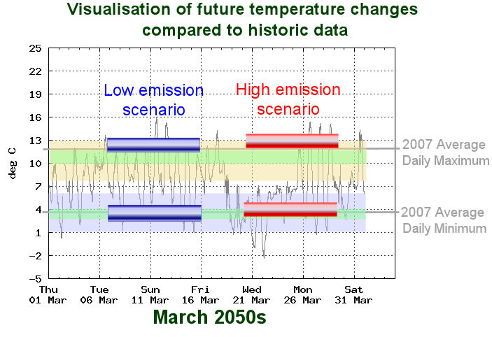
By the 2050s, under the Low emission scenario, there is a 67% chance that average temperatures for March:
By the 2050s, under the High emission scenario, there is a 67% chance that average temperatures for March:
|
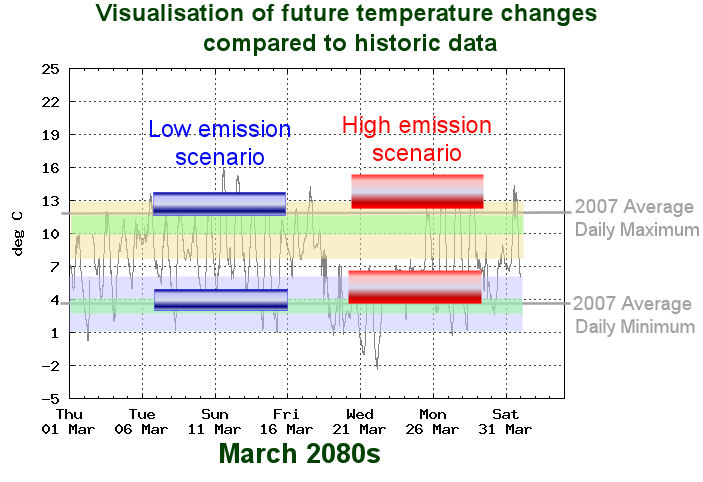
By the 2080s, under the Low emission scenario, there is a 67% chance that average temperatures for March:
By the 2080s, under the High emission scenario, there is a 67% chance that average temperatures for March:
|
.jpg)
Return to main Consequences page

![link to W3C validation website, which will show that the stylesheets are Valid CSS [css]](http://jigsaw.w3.org/css-validator/images/vcss-blue)
![link to information about this website [info]](../images/btn_info.jpg)
![jump up to the top of this page [top]](../images/btn_top.jpg)